 |
 |
 |
 |
 |
 |
 |
sparkledesign |
|
user interface web sites branding & identity research & usability stationary & brochures experimental |
|
kintana / mercury |
system |
|
|
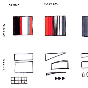
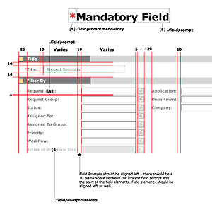
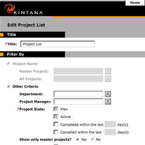
a branded interface Kintana (since acquired by Mercury) provides a suite of HTML-based software, used for IT Governance. My colleague and I designed the user interface for the 4.0 release, from initial branding concept to interface specs and instructions. We also designed our own processes and internal web-based reference materials. |
 |
 |
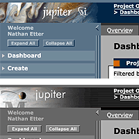
jupiter "skin" We also created a different style theme for internal use. |
 |
 |
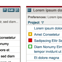
a bold new interface When Kintana was acquired by Mercury, the application interface needed to reflect the new Mercury brand (which was introduced just a short time after the acquisition.) Because we had designed the interface using Cascading Style Sheets, it was feasible to give the product a face-lift in a matter of months. |
 |
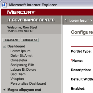 |
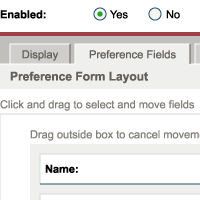
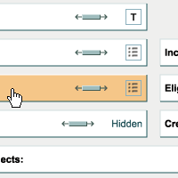
The new look is above all clean, with crimson accents that are bold but not too strong. Plenty of white shows the data off to best effect, and a range of subtle grays shape the application framework. Copyright 2006 Mercury Interactive Corporation |
 |
 |