katie ahlquist

sparkledesign

user interface

classrooms

info army

co practitioners

sun edison

fliqz

silver spring

samco

coverity

innotas

skyfire

a w e

jigsaw

bill.com

medstory

naehas

kintana / mercury

web sites

urban mapping

neodyne

action h r m

pagemill partners

castlight

skybox

samco applications

samco

dbm handbag studio

caslon

to nepal and back

sparkledesign

branding & identity

samco sstc

mpp apps

zoodak

saaspoint

syn

las fashionistas

bookkeeper's keeper

partners in progress

dressed to the nines

zadu

research & usability

designing responsiveness

persona posters

time management

hand grid

tide chart

stationary & brochures

best practices

hemispheres

journey

living large

wolfgang weingart

univers

eames

experimental

signs of the season

have you ever

deepsleep

inside/outside

singularity

seussstory

games

gifts & textiles

hand grid


analysis

design and science

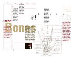
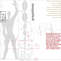
The architect Le Corbusier developed a system of human proportions from the Golden Rectangle. I expanded this idea to a specific part of the body, the hand, and developed a page layout grid based on its proportions.

View the spreads

columns (based on bones)
click to enlarge

detail: heirarchy (based on muscles)
click to view full image

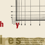
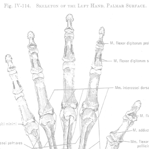
Systems of structure within the hand were the basis for three aspects of the grid: the columns are based on the bones, the margins are based on the ligaments, and the hierarchy of information is based on the muscles.

detail: margins (based on ligaments)
click to view full image