visual language
functional design tool
delivery +
page types
wireframe translation
delivery +
stylesheet creation
instructions and diagrams +
site usage and structure +
icons
online help styling +
product map
visual owner process +
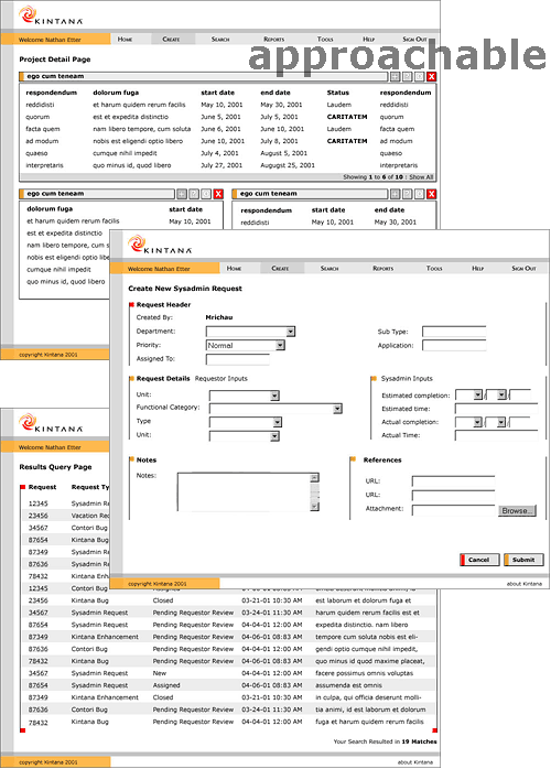
After a preliminary review where several of our concepts were selected, we went on to develop those into realistic screen-interface views, using a range of screens to test the versatility of the ideas. We developed a presentation to the Kintana executives, and were delighted when they selected our best idea, an efficient "powerful" look with gray backgrounds to pull the white content areas forward. The strong contrasts and bold attitude fit the Kintana brand perfectly.
