 |
 |
 |
 |
 |
 |
 |
sparkledesign |
|
user interface web sites branding & identity research & usability stationary & brochures experimental |
|
previous versions |
innovation |
|
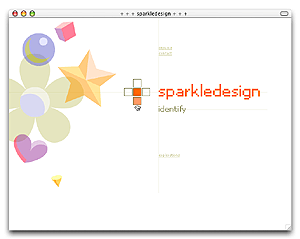
a sparkly web style My portfolio site reflects the growth of my web-building skills. This one was intended to utilize CSS to an extent that I could update the color scheme easily without requiring any other changes to images or code. |
|
|
|
|
|
|
 |
 |
|
|
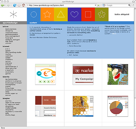
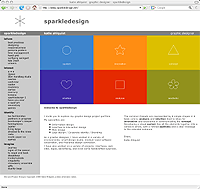
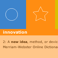
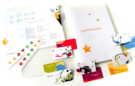
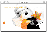
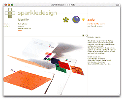
student identity and portfolio The product of my senior portfolio class, Sparkledesign was created to be my "visual personality." It has become a lasting statement of versatility, creativity, and design principles in a full spectrum from analysis to aesthetic. The identity system includes 6 colors, shapes, and fanciful characters; these appear on stickers, a variety of business cards, resume, and print portfolio book.
|
 |
|
| The online portfolio showed four categories of projects: interactive, identity, imaginative, and information design. The projects took center stage, but for curious viewers the meanings behind the icons and their representative characters were available for discovery.
|
 |
 |
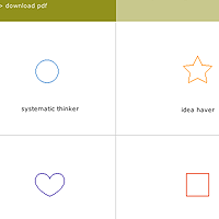
| Each project was identified with 3 of the 6 icons, to indicate which principles most strongly influenced the project. |
 |
 |