original kintana > mercury brand guide > theme development > presentation > UI details > final screen design > range of screens > specifications
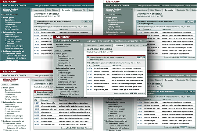
The first
step was to generate various ideas of how the Mercury logo, color palette,
and thematic ideas could be applied to our product interface.
Each idea was evaluated against the brand to see if it fulfilled the goals
set by the thematic words.
We discovered that the logo was more "Bold" when it was reversed
out of the crimson color than when it was crimson-on-white.
Too many soft colors and grays did not give a "Clean" effect.
The most "Professional" option turned out to be a hybrid that
combined the best aspects of all the sketches.