original kintana > mercury brand guide > theme development > presentation > UI details > final screen design > range of screens > specifications
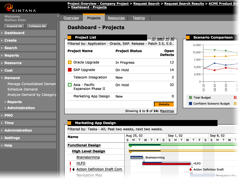
The Kintana
product had evolved with the new functionality introduced since the 4.0
release.
New navigation structures included a collapsible global menu on the left,
a navigation "path" on top, and tabs on the dashboard.
The overall brand feel was still very much the same, with high-contrast
black, grays, and sparks of orange.
The Mercury Brand challenge was to re-invent the interface look and feel
using CSS without changing the well-established application structure.