 |
 |
 |
 |
 |
 |
 |
sparkledesign |
|
user interface web sites branding & identity research & usability stationary & brochures experimental |
|
innotas |
intuition |
|
|
project portfolio management Innotas provides IT organizations with on-demand software for Project Portfolio Management. For this UI redesign, we focused in on the Project Management segment of the functionality, wanting to provide PM’s with tools and processes that were more streamlined but also more flexible. A Project exists in the Innotas system as a set of views and data screens that allow the PM to create, update, and track health and task progress. Work performed as a designer for Copyright 2013 Innotas. All rights reserved. |
|
|
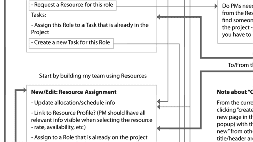
Innotas provided us with data they had collected from their users about the issues and problems in using the product, as well as analysis they had done internally about what was working and what wasn’t, and their goals for improving their competitive advantage in the market. We created Conceptual Maps and Navigation Maps as guides to designing the sequence of actions that the user will take as she navigates through the processes of Project Managment. |
 |
|
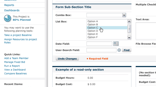
Our next step was to create "wireframes" of key application screens. Our goals: To establish the information hierarchy on each screen: the most important info should be most highly visible Get all the functional elements in place and address layout issues. Evaluate functional decisions without the distraction of graphical or subjective elements such as colors. |
 |
|
| To develop visual theme options for Innotas, we applied brand concepts (colors, shapes, fonts, images) to several approved Wireframes, in three distinct variations. | 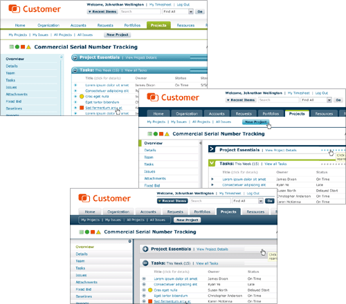 |
|
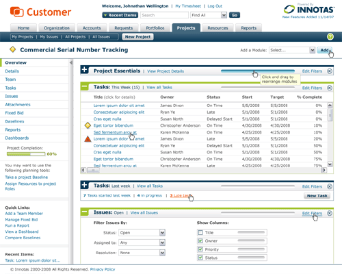
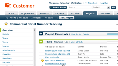
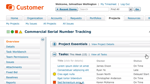
Once the visual theme was refined and approved (it ended up being a hybrid approach between a dark, shaded navigation bar and strong, colorful section headings) we applied the theme to all Wireframes, making adjustments as necessary to consistently apply the theme concepts. This provided the client with a detailed picture of how the product would look when the new UI was implemented.
|
|
|